
Fixing a navigation growing faster than the product
29 nav items. 6 teams. 20 stakeholders. One framework that cut it down to 14.
The problem | 12 nav items to 29 in two years
Two years before this project started, the ODC portal had 12 navigation items.
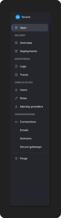
By the time we began, it had 29 with 4 more on the way.
That's 15 items added in two years with no end in sight.
The instinct was to treat it as a UI problem. It wasn't. It was an architecture problem.
Users weren't confused because there were too many items. They were confused because the items didn't make sense together. In my research of the problem, one user summarized it well.
"The nav in portal is too broad. I can configure front-end things AND back-end things and it feels like it's all over the place.”
The real issue was everything you could configure on our system's biggest object, an organization, had been broken out into separate nav entries. They were scattered across the sidebar as if they were peers of the main product objects. The navigation exposed the product's early internal architecture instead of reflecting how users actually thought about the product.
Power BI usage data confirmed it.
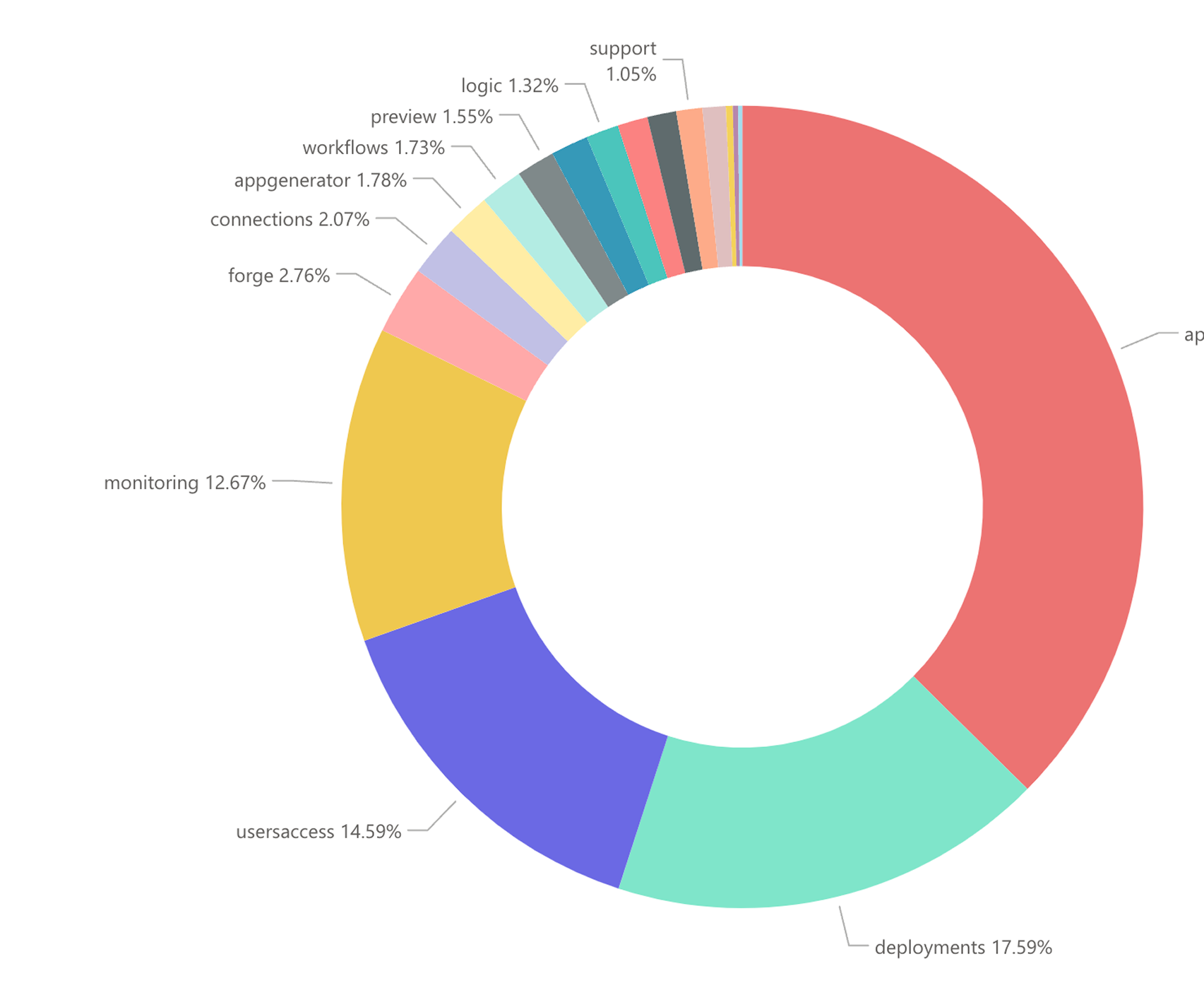
Our main object, Apps, and their related workflows dominated. Almost all of the tiny, microscopic slivers were configuration consoles. Users weren't ignoring them because they were hard to find. They were a "set it once and rarely come back" function.
My role | Framework creator, proposal and governance lead
I created the initial framework and vision for the restructure, co-led the proposal process alongside another product designer, and led the Navigation Committee, a cross-functional governance group responsible for approving new nav entries. In practice that meant running card sorts, analyzing Power BI usage data, doing competitive analysis across five industry-leading products, facilitating a proposal session with 20 stakeholders, and building the governance committee that would keep the nav consistent after the project ended.
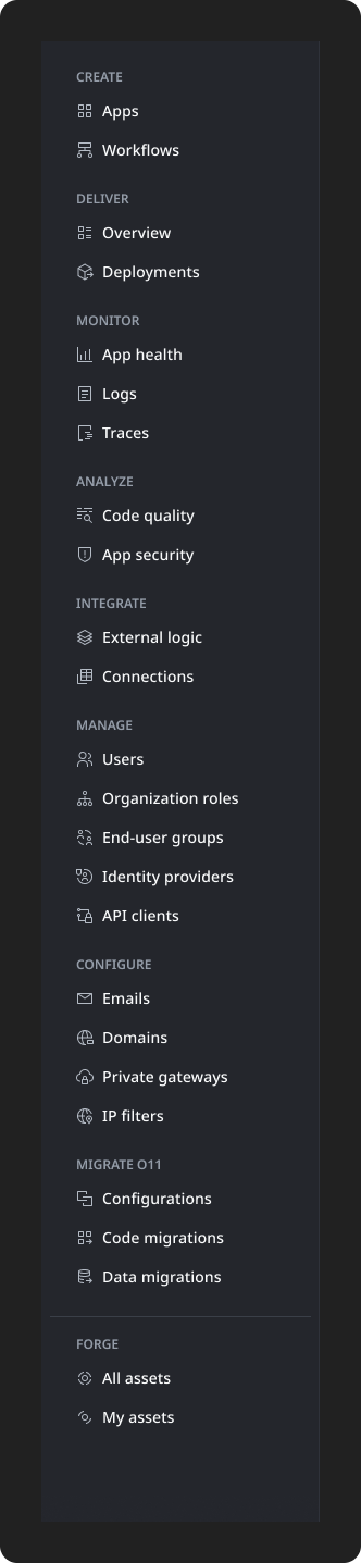
Shortly after the proposal was approved and work began, I was moved to a different initiative. Another designer carried the work forward using my foundations, ultimately bringing the navigation down to 14 items. The framework was robust enough to survive a full designer handoff without significant rework. That's part of the outcome.
The process | Finding the real problem inside the obvious one
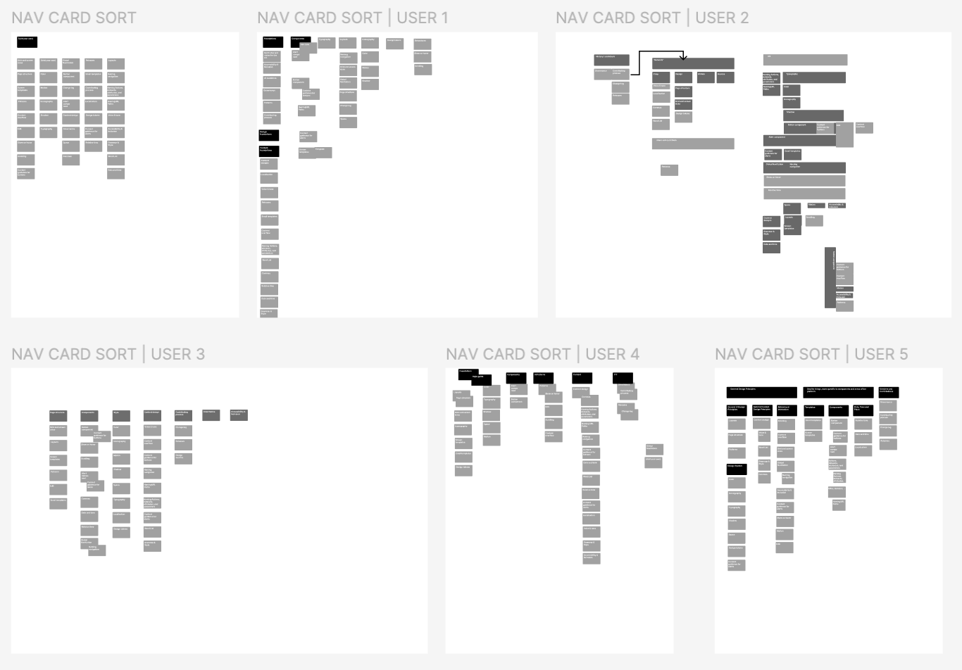
Before proposing any changes, I needed a principled way to decide which nav entries belonged at the top level and which didn't. My first attempt was a simpler rule, keep anything a user visits more than once a week, move everything else. I ran that against the Power BI data and some user card sorts. It helped, but it didn't explain why the remaining items still felt incoherent together. Usage frequency was a symptom, not the cause. So I ran more research to find the actual cause.
The real framework came from asking a different question, “what does the nav entry represent in the system?” not “how often is it visited?” I developed a framework called "architecture levels," which grouped objects by their position in the product hierarchy.
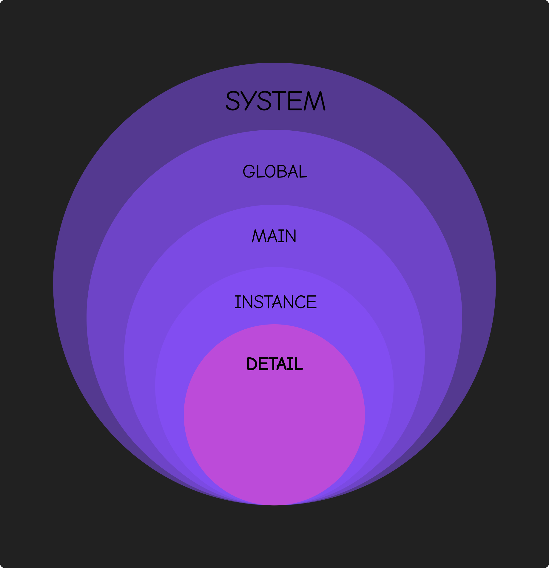
The core insight was that a lot of what was in the navigation wasn't actually a main product object. It was a configuration on a main product object. Emails, domains, IP filters, content security policy, all scattered across the nav as if they were peers of Apps, but they were settings on the Organization object. The global object that where configurations defined how the platform worked for everyone.
Before presenting this framework internally, I spent time analyzing how industry-leading products handle the same problem. Jira, Notion, Webflow, Airtable, and ChatGPT all couple configurations with their parent objects rather than surfacing them as standalone nav entries. In Webflow, workspace settings live inside the workspace. In Airtable, base settings live inside the base.
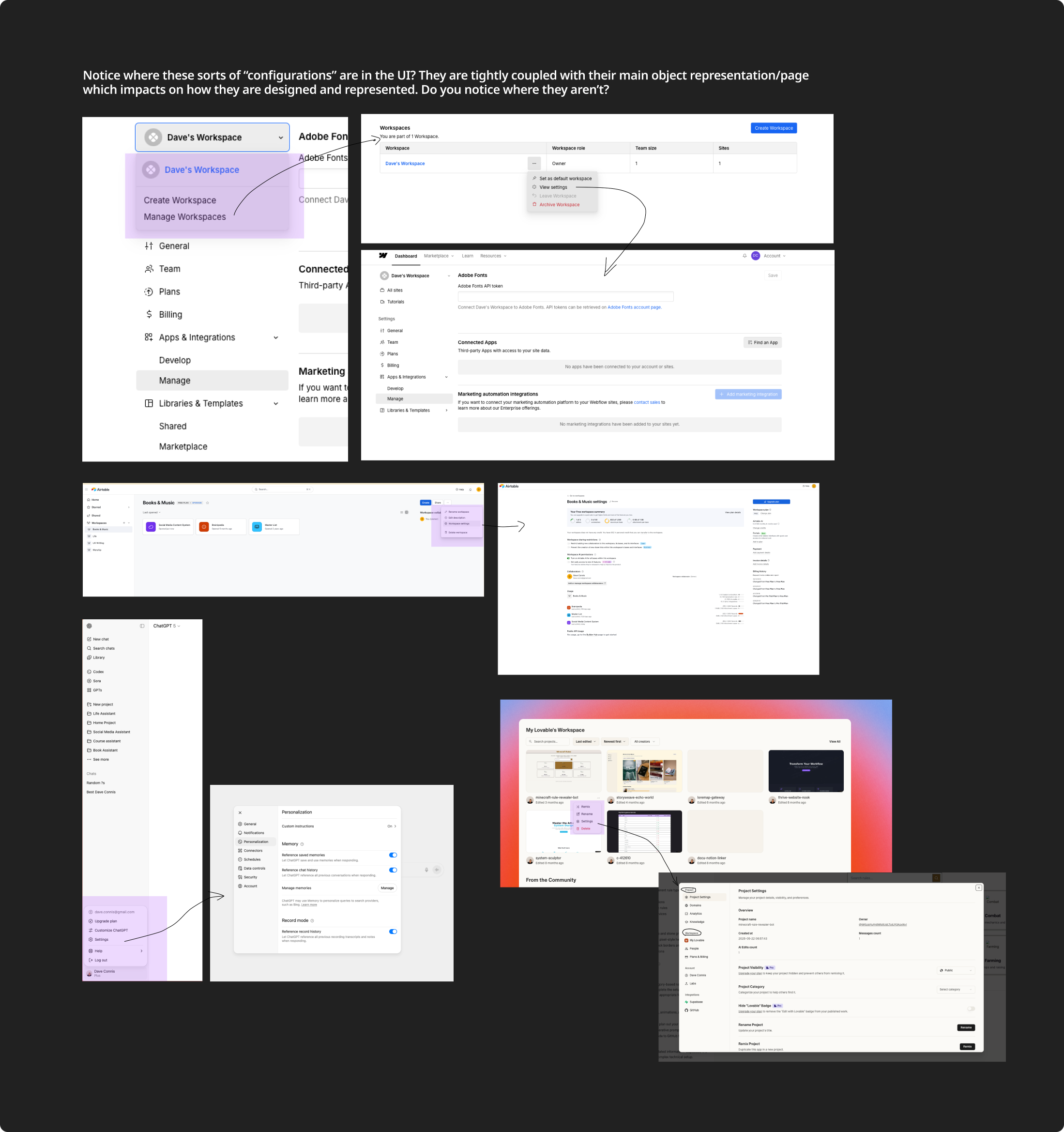
The pattern was consistent across nearly every product we looked at. ODC was the outlier. I presented this framework to collaborators across all teams, designers, engineers, architecture leads, PMs, and so on to get both feedback and buy in. After a few iterations, I moved onto testing some hypothesis.
Using a mix of card sorting and interviews, I found that four out of five users didn’t expect to see object-specific configuration in the main navigation. The competitive data, plus user data, made the framework argument much harder to dismiss in stakeholder meetings. It wasn't a design opinion, it was an industry standard we weren't meeting.
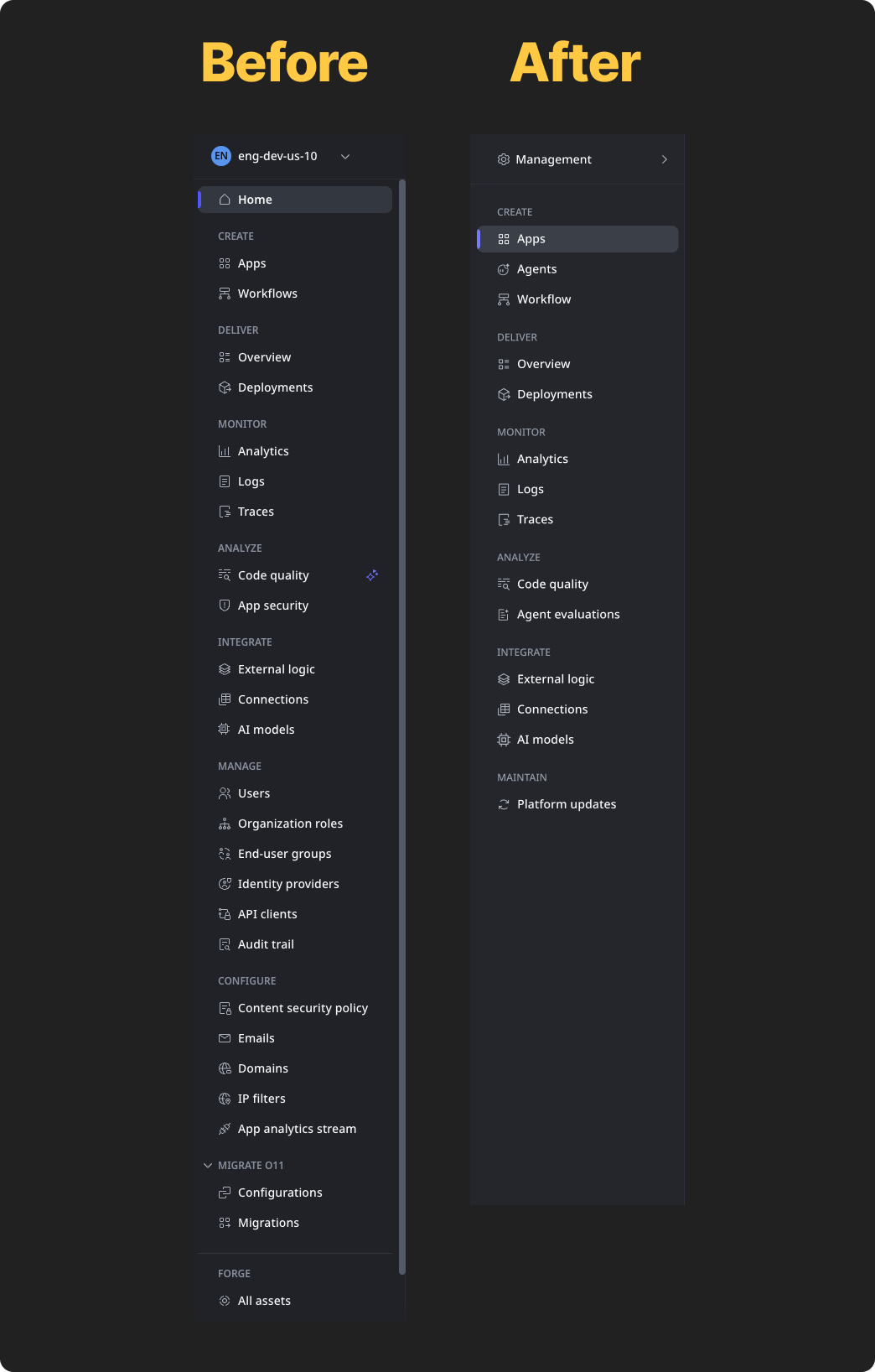
The framework gave us a clear rule, top-level nav entries should be main objects or flows in service to main objects. Configurations live inside them or in their own section. Applying that rule consistently, we could remove around 10 items from the navigation with an initiative, immediately. With additional consolidation, the target was 14, which is ultimately what we got to.
This project was one of the hardest I’d ever taken on in my career. Getting alignment felt nearly impossible. Because of how our organization was structured, multiple nav entries had a different team responsible for them. That meant 6 teams, each with 6-10 people with opinions, histories, and roadmap dependencies, were involved.
I ran a structured process to further validate the problem and solution. I did usability testing to further validate the problem, Power BI data to show what users actually visited, and ran A/B testing on multiple mocks and wireframes to gather user data,
I worked with a lead product designer beforehand to anticipate the objections each team was likely to raise and prepare framework-based responses for each one. I remember one proposal session had approximately 20 stakeholders, including the head of PM. When anyone pushed back on a specific item, the question we kept returning to was “is this a main object or a configuration on a main object?”. That question resolved more debates than any design argument could. And when opinions got heated, the competitive analysis and user data gave us neutral ground. “This is what users think” and “this is how the products your users already know handle this problem.”
Alongside the restructure work, I led the Navigation Committee, a cross-functional group whose mandate was to approve new nav entries and ensure the navigation stayed consistent as the product grew. It was an attempt to fix the root cause which was that things got into the nav because teams requested it, not because it made structural or architectural sense. While the committee's decisions were sometimes overruled by PM priorities, it established a process and vocabulary for navigation decisions that hadn't existed before.
Impact | 52% reduction, 20 stakeholders aligned
Navigation reduced from 29 items to 14, a 52% reduction.
Proposal aligned 20 stakeholders across 6 teams including the head of PM.
Navigation Committee established the first governance process for nav decisions in the product's history.
Framework was robust enough to survive a full designer handoff without significant rework.
What I'd do differently | Lead-level authority buy-in is critical
The Navigation Committee needed executive sponsorship from day one. One of the reasons it was so hard is that I was fighting an organizational battle without the authority and support of leadership. However, this wasn’t because I didn’t try to get it.
While we had a group of very respected people in the committee, a cross-functional governance body without clear authority will always lose to quick wins and individual team priorities. We were doing the right thing, but without organizational backing to enforce it consistently. Before starting, I'd get formal written commitments, with support on specific, concrete deliverables, before forming the committee, not after realizing we needed it.
I'd also push harder to stay on through the first phase of implementation. The designer who took over did excellent work, but there were alignment gaps that earlier continuity would have prevented.