
Designing with AI
I made AI prototypes more consistent. Stakeholders assumed they were final. Two years of working with AI taught me that the obvious move isn't always the right one.
The context | What does AI break?
Most conversations about AI in design focus on making things better. Better prototypes, better documentation, better output. I've spent the year or so asking a different question, “what processes does AI break and is that always a problem worth solving?”
One piece of work I led wound up with an unexpected finding. Making AI prototypes more consistent with our design system made stakeholders assume the designs were final. A more polished output was undermining our design process. Until our process changed, the right answer turned out to be keeping the prototypes deliberately rough. Sometimes inconsistency is a feature.
That kind of counterintuitive finding is what fuels my interest in AI. Instead of drinking the hype-y “AI is a game changer” kool aid and spending hours benchmarking tools to see what they do, I looked at how, in the day-to-day, does AI actually change the game?
Here are three pieces of work that shaped how I think about AI as both a design material and a design tool. In each case, I treated the work as a design experiment with a hypothesis, a test, and a finding that often contradicted the original assumption.
Designing expectations | When more detail made output worse
OutSystems built an AI-powered app generator called Mentor, running on a platform called Morpheus. The product took a natural language prompt and generated a working low-code application.
My role was designing the content for the onboarding experience and the prompt writing guidance. The core design challenge came from a surprising research finding. Users assumed that more detailed, thorough prompts would produce better results. Many were uploading full product requirements documents, spending hours preparing them before generating an app.
But research showed the opposite was true. Small, contextual prompts, outperformed long requirements docs in output quality.
Because users were spending so much time on detailed requirements, one mentioned spending over six hours, when the generated app diverged from what users had painstakingly written, disappointment in the new tool skyrocketed.
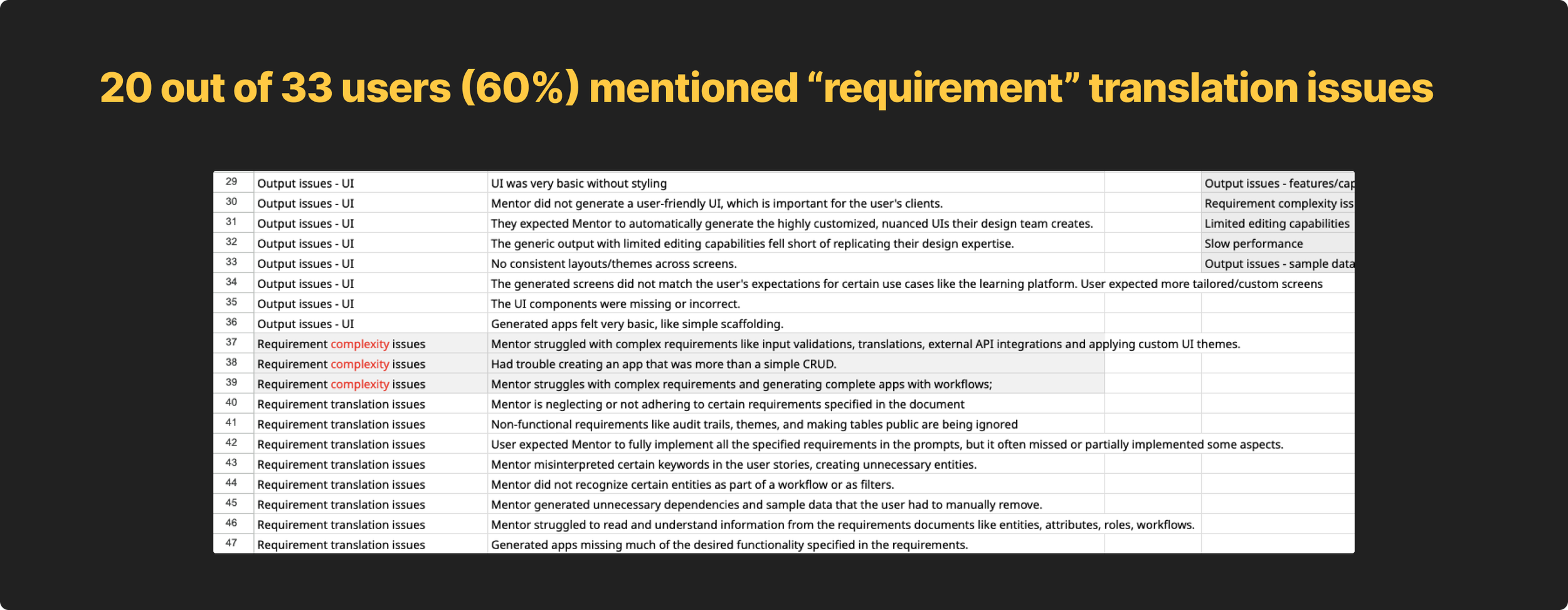
This expectations mismatch was the biggest detractor in satisfaction scores.
My job was to help decrease disappointment and help users understand that before they ever wrote a prompt. I did three things.
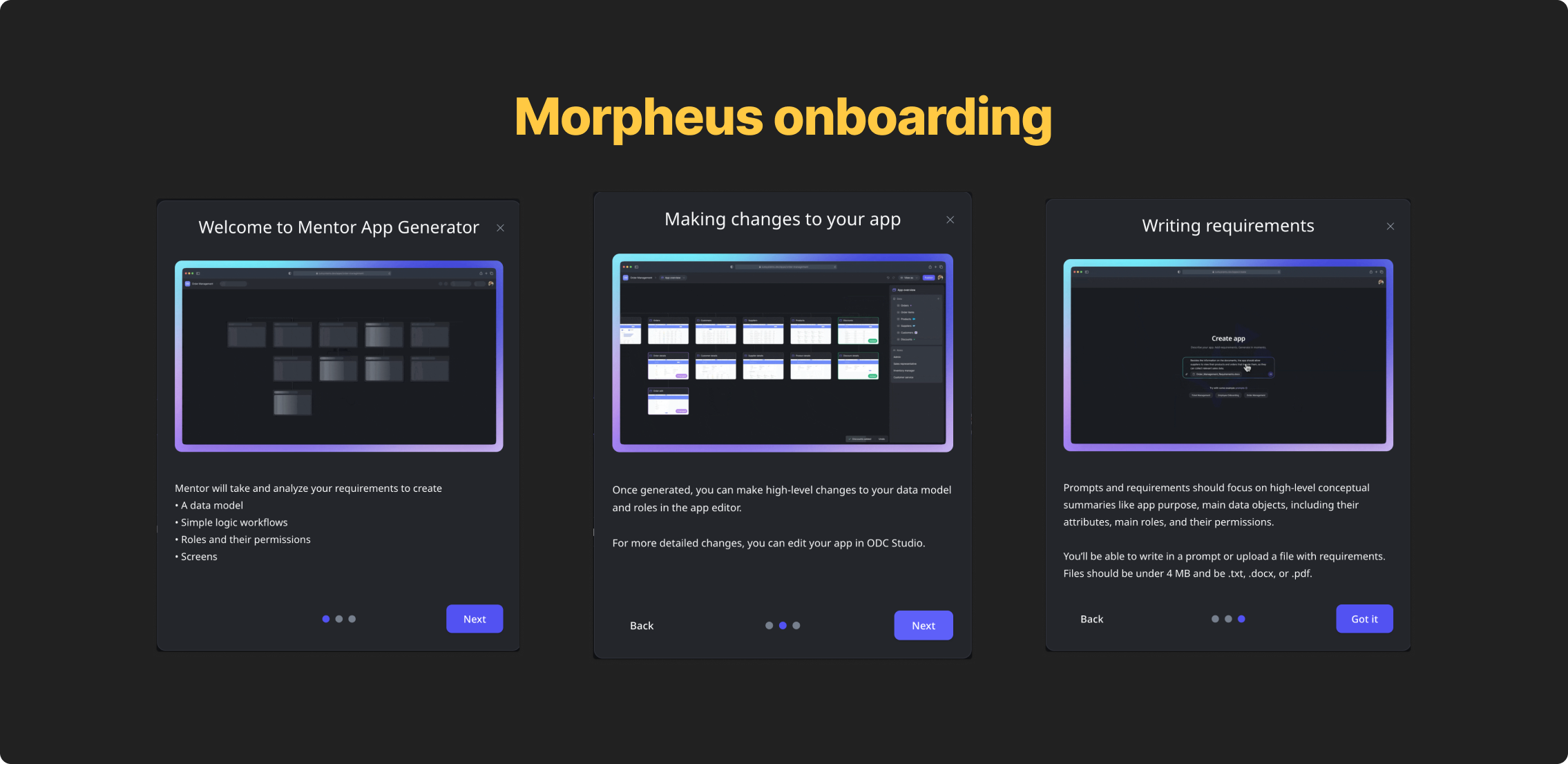
First, I designed a three-screen onboarding flow that walked users through what Mentor could do, how to make changes after generation, and how to write a prompt that worked. PMs wanted a single tooltip-style callout for this information, I pushed back. Tooltips are a pattern to give users information that’s helpful, not critical, to get a job done. Because this was critical information users need before taking action, a tooltip wasn’t appropriate.
Testing validated the concern. At best, users skimmed the tooltip. Most didn’t read it at all. almost 94% still wrote prompts that were too implementation-heavy. The three-screen flow slowed them down intentionally, with each screen addressing a distinct mental model failure we'd seen in testing.
Second, I designed and wrote example prompt chips directly below the input field, that, when clicked, injected example prompts that followed our established best practices into the input.
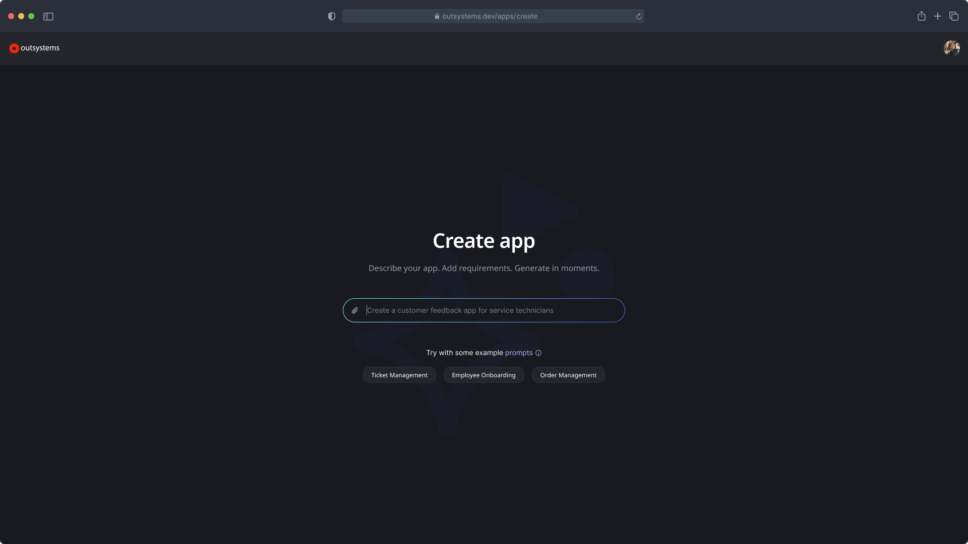
The goal was to show the right level of abstraction before users had written a single word, not tell them, show them.
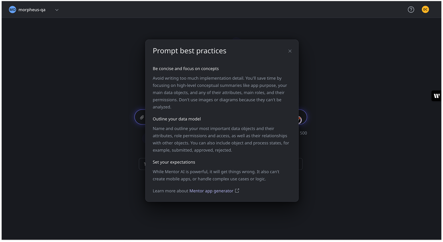
Third, I created the prompt best practices modal with three sections:
Be concise and focus on concepts
Outline your data model
Set your expectations
The last section, explicitly telling users what the AI couldn't do, was the most important. By letting users know that it couldn’t handle mobile apps, complex logic, edge cases, made the experience more trustworthy, not less.
Honesty about limitations built more confidence than overselling capability ever would.
We tested again and immediately saw increased satisfaction because of education and expectation setting. While users still felt their requirements weren’t being translated correctly their expectations were much lower, which meant they weren’t as dissapointed when AI got it wrong. One user said, “it didn’t correctly parse my data model, but it did a pretty decent job…despite it’s limitations.”
More educated and context-aware users shifted requirement translation satisfaction scores from 2.8 to 3.6.
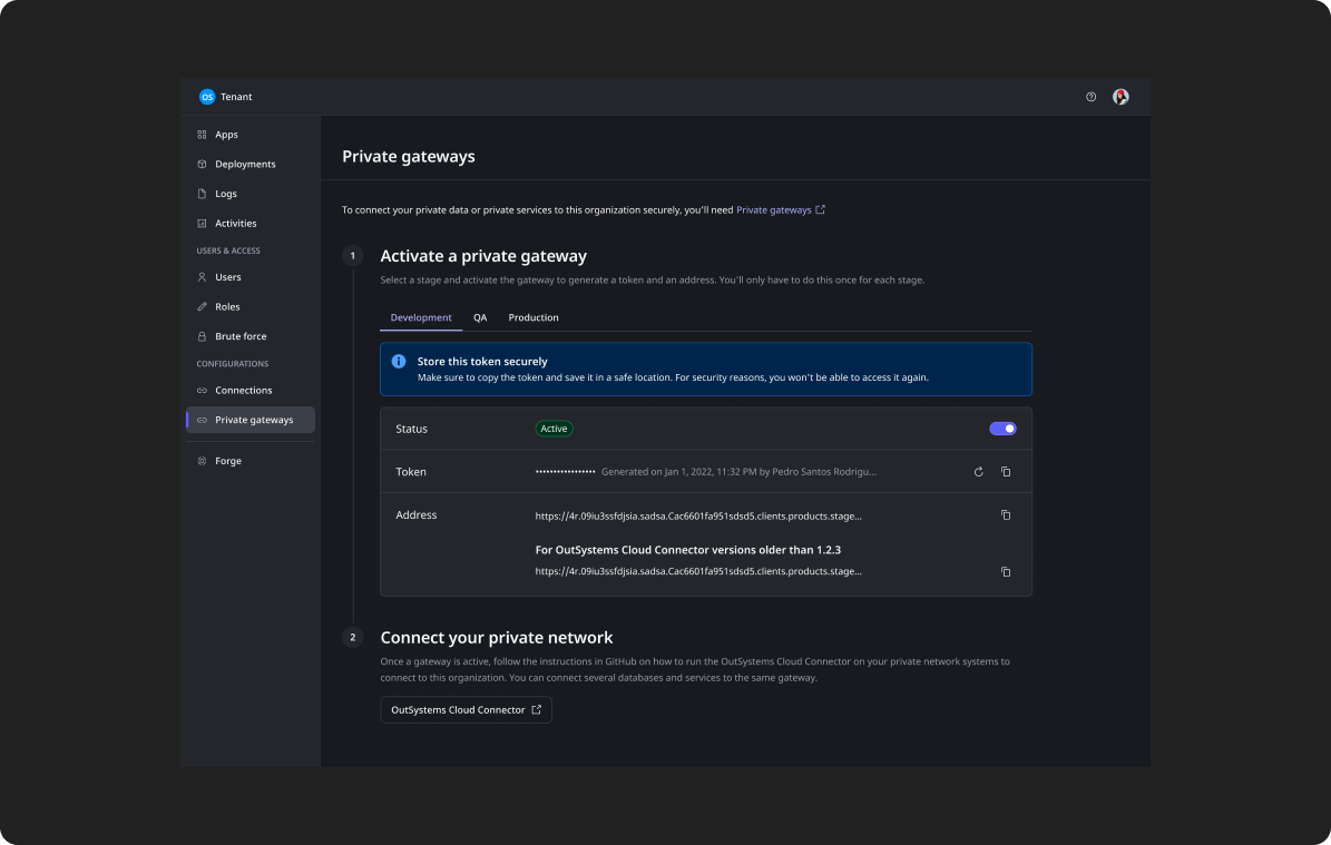
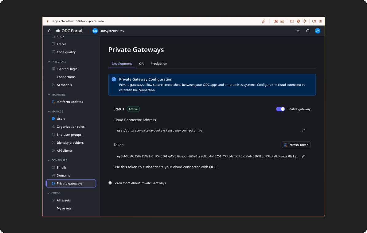
Better prototypes, confused stakeholders
OutSystems designers were using Cursor to generate prototypes using AI, but they hadn’t connected it to our design system yet. Before we wired everything up, just assuming it’d make everything better, I wanted to understand exactly what would happen once we embedded our content guidelines, design system docs, token JSON files, and front-end CSS files directly into Cursor as prompt context. What moved the needle? What, if anything, would make the output be more consistent with the design system?
The answer was all of it, but consistency created a problem nobody anticipated.
To start the experiment, first, I captured a baseline, a hifi screen in Figma. I made sure that it was fully following our design system standards with correct tokens applied.
Then, in Cursor, I cloned our design system repo which included our token JSON files, set up Figma MCP and then selected the baseline screen and asked Cursor to recreate it.
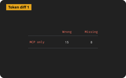
I ran a code diff on values the recreated screen had verses our tokens in GitHub.
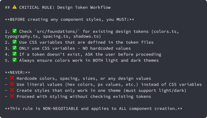
For the second iteration, I converted all of our design system documentation, including the content layer, into a few .md files added them to Cursor along side some guardrails in the Cursor rules file that explicitly stated to respect the existing design tokens in our JSON files.
I then selected the baseline Figma node again and asked it to recreate the screen.
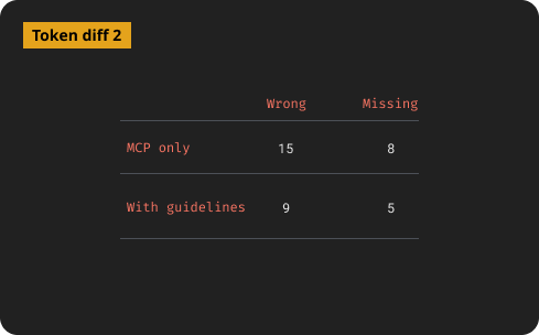
With some wonky exceptions, better documentation did produce more consistent, guideline-aligned prototypes, but there were still plenty of inconsistencies with the design system. After this iteration, a few designers started using this repo to build their prototypes with Cursor.
While designers were testing a Cursor-driven design cycle hooked to the design system, I got our component CSS file from our front-end team and added it to the repo, added a few extra rules, then tried again.
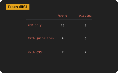
Then everything changed.
On a sync with the designers using Cursor, I learned that the more “finished” the AI output looked, the more stakeholders assumed it was a final design. Designs meant to be exploratory were being treated as commitments. Designers were spending more time managing stakeholder expectations than doing design work.
That led to a harder question, “why were we trying to make AI prototypes better in the first place?”
For our org, there was no good way to push the prototype to the next level of the design process. Hifis still needed to be built in Figma, so the value of a prototype was that it could be iterated on fast, but still looked unfinished. Deliberate inconsistency was actually protecting the design process, keeping stakeholders from locking in before the real design work had started. The work ended not with a solution but with a reframe. Instead of our goal being AI prototypes that look more like final designs, it was AI prototypes were clearly and intentionally rough.
The reframe led to a new question. If polished output wasn't our goal, could we give every designer the same starting point instead?
I began working with a small group of designers to build an AI-tool-agnostic starter kit. A set markdown files connected to our design system styles, tokens, and guidelines that any designer could pull into their AI tool of choice specifically for prototyping. The idea was that consistency didn't need to come from polished output. It could come from a shared foundation everyone started from.
The project was in early stages when my role was terminated, but the lesson behind it was striking. Enterprises can’t just say “go faster by designing with AI” they also have to rethink their design and development processes to support AI-driven design.
An AI content review agent | When docs aren’t enough
The hardest content design problem on a large product isn't writing the content. It's maintaining consistency as the product grows and teams multiply. Even with a solid content design system layer, every new designer makes micro-decisions about copy. Over time those decisions compound into inconsistency.
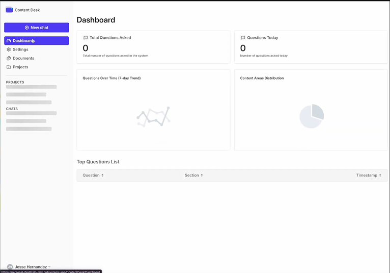
I co-designed and led the model training for Content Desk, a proof-of-concept AI agent trained on OutSystems' design system documentation and content guidelines.
The idea was to make design system guidance conversational. Instead of searching through docs, a designer could ask a question and get a specific, guidelines-grounded answer.
Because our design system docs were in the middle of being rewritten, we started with the proven content guidance I’d built in case study 1.
The first version of the agent was trained on raw content documentation and returned answers that were technically correct, but too long and general to be useful in the middle of a design decision. I refined the training to prioritize context finding first and then deliver short, actionable answers with direct references to specific guidelines. That iteration made the difference between a tool designers opened once and one that felt like a partner in the design process.
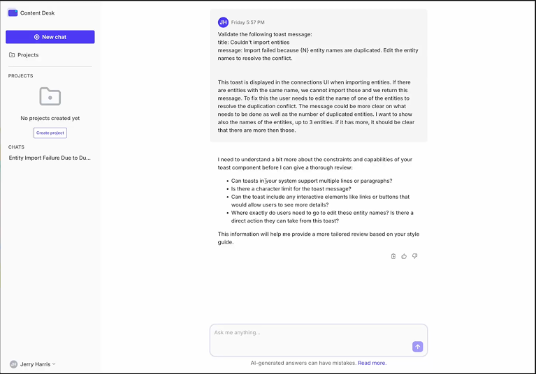
The interface was a chat UI with a project sidebar, and configurable assistant settings. We ran real queries through it during development. One example from the session logs was a designer asking about a toast message error for duplicate entity names during import. Content Desk responded with a specific answer about the constraint and asked clarifying questions to give better guidance.
We were also proofing out a analytics dashboard that would help the design system see where designers were most confused and give us data we needed to identify gaps and prioritize work within the design system.
The project was the first step in a bigger design system review agent that, ultimately, would give feedback on all parts of a design (behavior, design tokens, states, etc) The project was paused when my role ended, but the thinking behind it, that design systems need a conversational interface to be truly usable at scale, is something I'd continue in any role.
The pattern across each work
Each piece of work pushed against a simple assumption about AI.
Morpheus pushed against the idea that AI will figure it out. Users need to understand the model to work with it well.
The Cursor work pushed against the idea that better AI output is always better. Sometimes roughness is a feature. It also pushed against that idea that just injecting AI tools into a process will automatically make it better and faster.
Content Desk pushed against the idea that documentation is enough. At scale, guidance needs to be findable in the moment, not filed away somewhere.
The pattern across all three is that while AI changes what's possible, but it doesn't remove the need for clear thinking about what you're actually trying to do.