
Untangling a complex product, designing the Platform Updates console
Alert fatigue. Broken trust. Opaque updates. Two design iterations and 10 usability tests later, 3,200+ ODC developers felt more in control of their platform.
The problem | When users stop trusting their own platform
OutSystems users were losing trust in their own platform. When updates rolled out automatically, applications broke without warning. When they tried to understand what was happening, they faced a wall of opaque status emails, inconsistent terminology, and a UI that offered no sense of control or predictability.
Research and support data revealed a clear pattern. One user in testing summarized it best:
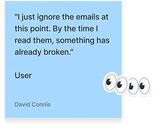
We called it “alert fatigue”, and it was costing customers control over their own platform stability.
There were already fragmented update features in the product, so when the initiative came to us the design challenge was more than visual. It was conceptual. The real question was “how do you make something genuinely complex, with so many different concepts, states, and statuses, feel understandable and controllable?”
My role | IA, conceptual model, and the email system nobody was reading
I contributed to the UX wireframing and conceptual design of the Platform Updates console, the primary interface customers use to monitor, schedule, and manage updates across their application portfolio. In practice, this meant leading concept and object modeling sessions with product architects, running two rounds of moderated usability testing, writing every email template in the notification system, and wireframing the console across multiple states in Figma. I worked with multiple product designers, product architects, and PMs across 3 different teams to get there.
The process | Solving the conceptual problem before the visual one
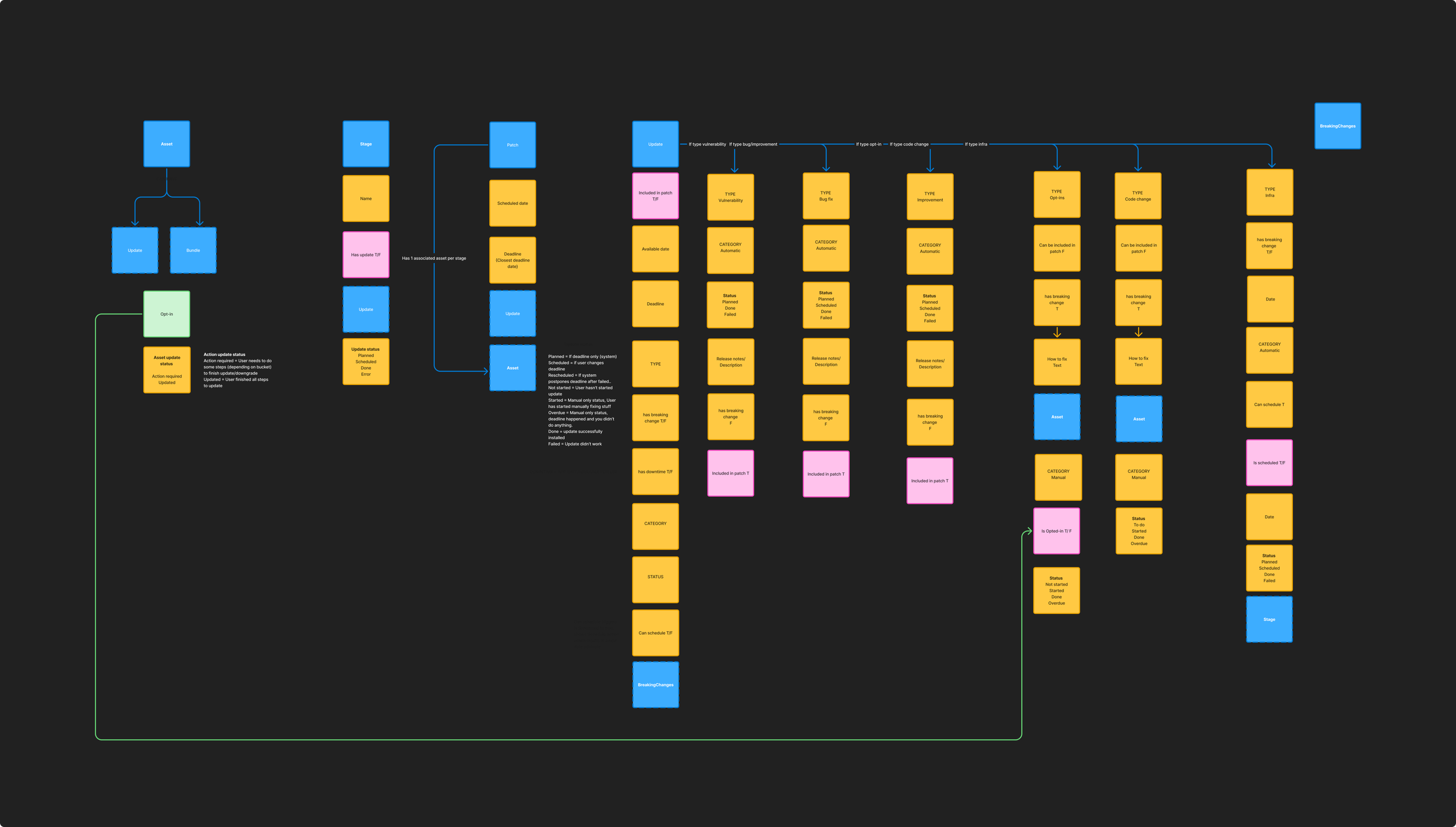
Before we could draw wireframes, we needed to understand and make a simpler, unified version of the underlying data model. Easy peasy, mac and cheesy, right? The system had five interconnected objects: Assets, Stages, Patches, Updates, and Breaking Changes, each with their own attributes, conditions, types, statuses, and relationships. Different stakeholders used these terms differently. Engineers meant one thing by "update," product managers meant another, and customers meant something else entirely.
Working with product architecture, I led sessions to map and unify the full object model, defining each concept and its relationships. This became the conceptual foundation the UI was built on.
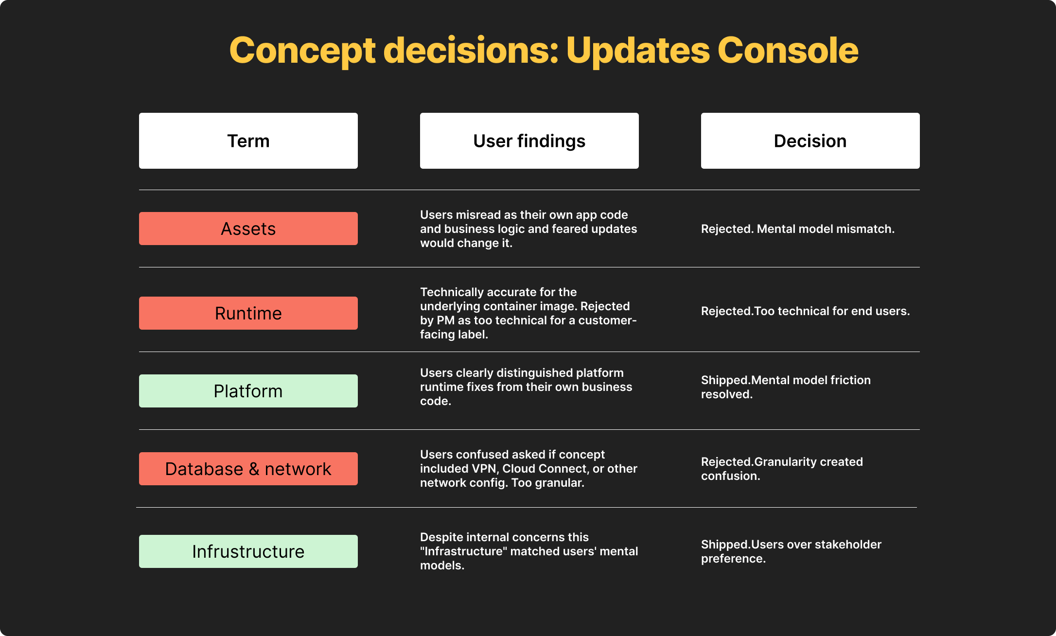
One critical decision that came out of this work was renaming "Assets" to "Platform" in the customer-facing UI.
Our first instinct was to keep the technical term since the platform was developer-facing, but usability testing with 10 participants across two iterations showed that "Assets" consistently confused users because they were technical.
Technical customers thought it meant "code assets" which has a specific set of concepts (src files in code, stored images, etc) rather than our internal idea of their own portfolio of “all the stuff you’ve built in OutSystems”. We tested "Resources" first, which also failed for similar reasons. "Platform" was the third attempt and it immediately clicked in testing.
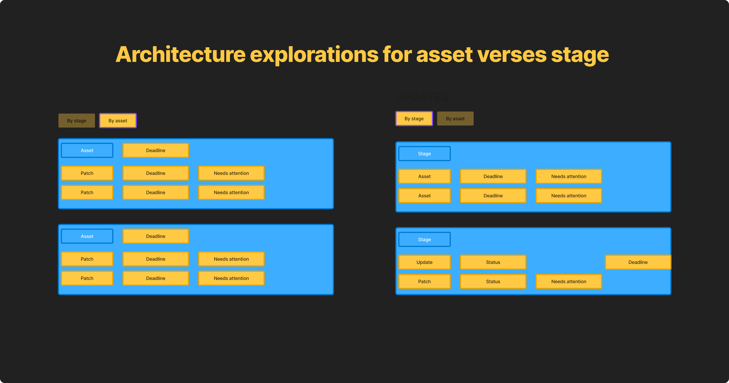
The core IA challenge was that customers needed to answer two fundamentally different questions depending on their role: "What's happening to my stages?" for operations and infrastructure teams, and "What's happening to my apps?" for developers.
I designed a two-tab architecture, "By stage" and "By asset," that let customers switch between these mental models without losing context. This wasn't just a UI pattern decision. It was a conceptual decision about how the product understood its own users.
One of the biggest sources of customer frustration was the email system.
Customers received a TON of generic update emails, which ultimately made them ignore most update communications including critical action-required alerts.
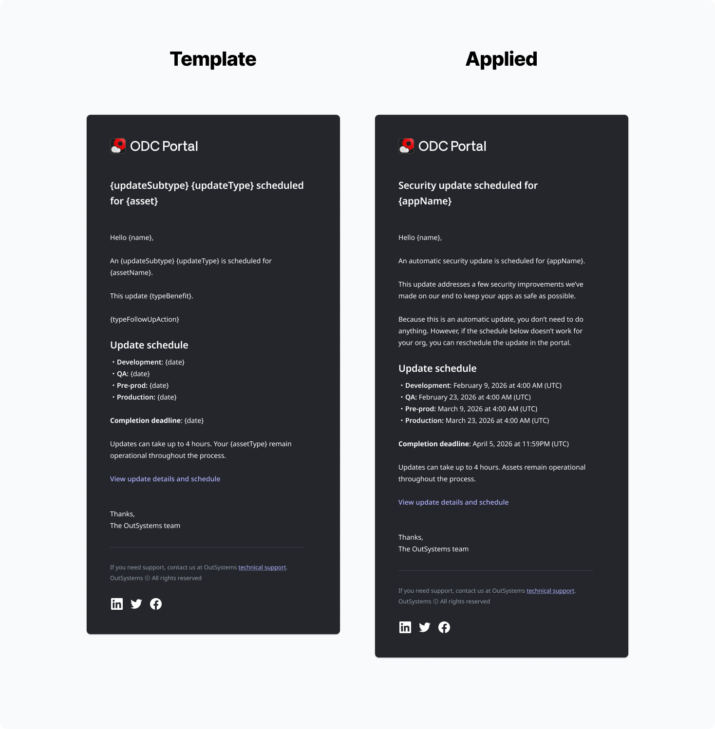
I designed the full email notification system, mapping every trigger point across the deployment lifecycle, breaking emails into to types that followed the conceptual model we defined in the UI (patch, update, breaking change) along with sub-types like “security” and “opt-in” for updates.
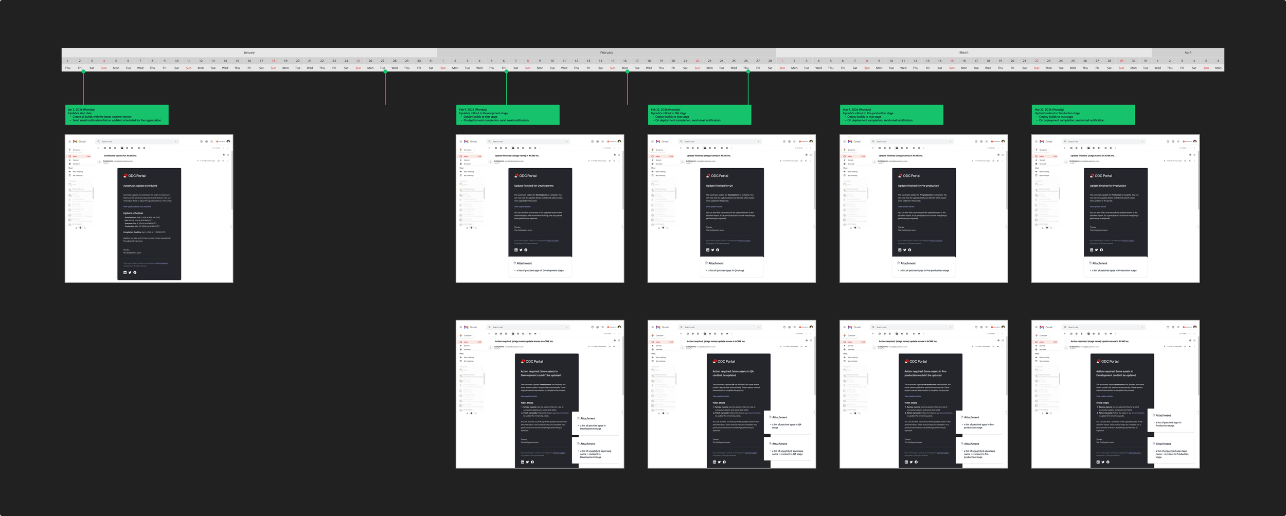
Using this, I wrote modular templates for each update object type, establishing a clear hierarchy between informational emails and action-required alerts. Alongside documented guidelines and dynamic variables, this made a mini-content system for this process. This way when new updates came up, anyone, not just designers, could easily inject update specific information with the following high-level framework:
{What} + {Benefit} + {action}
The goal was to reduce noise so that when a critical email arrived, customers had the information they needed to feel empowered.
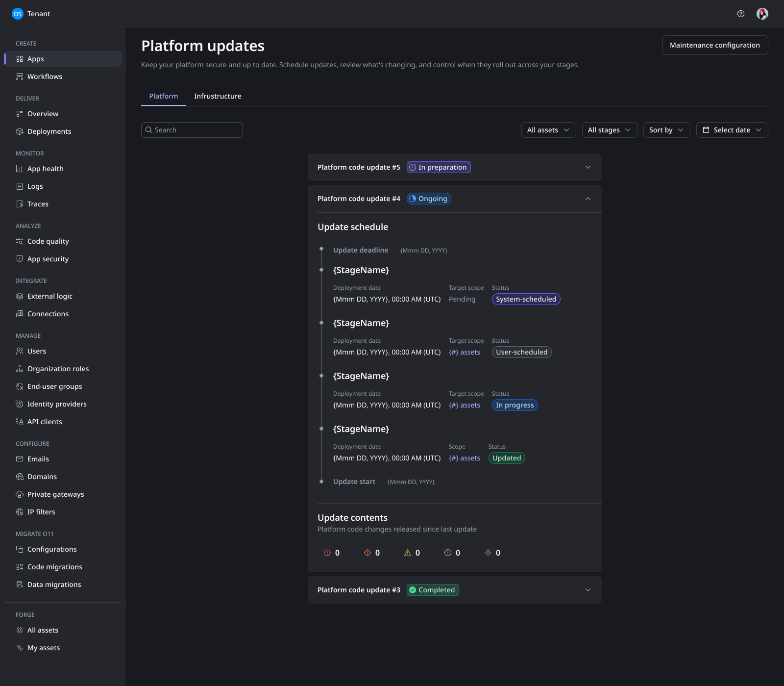
Working from the same conceptual model and IA I established from the very beginning, I wireframed the Platform Updates console across multiple states:
the list view with severity and stage filters
the update schedule view showing deployment timelines
the update contents panel distinguishing security fixes from bug fixes and breaking changes.
Each state was designed around a single principle, customers should always know what is happening, what will happen next, and what, if anything, they need to do.
Impact | What 10 usability tests and two design iterations produced
Every impact metric below came from structured testing, not assumption. The design was validated through 10 moderated usability tests across 2 design iterations, plus asynchronous feedback from 7 MVP users:
4/5 or 5/5 ease of use scores for platform across all testing sessions.
Email system saw increased satisfaction from 7/10 users. “I actually understand what’s happening and know what to do now. This is so much better.”
Alert fatigue reduction. The email system redesign reduced overall communication noise, making action-required alerts significantly more visible.
Conceptual clarity. The "Assets" to "Platform" rename, validated across three naming attempts in testing, resolved a fundamental comprehension gap that had existed since the product launched.
Projected 22% SLA compliance improvement. Fewer applications remaining unpatched past the 6-month maximum allowable cadence. This was the key success metric the team defined to measure whether the redesign actually changed user behavior.
User satisfaction target. Sustained scores above 4/5 in surveys regarding ease of use and control.
What I'd do differently | Bringing in the right people, not just people
I would’ve worked with product architecture sooner.
Architecture deliverables were often considered technical back-end work that no one sees, however, their data schemas came first and therefore, ultimately, influenced the concepts that the UI was designed around. I should’ve seen it coming that that object models built with UI in mind instead of code will differ. This is a feature not a bug, the outcomes for both models are different. Architecture is looking at performant data models, I was looking at clear concepts that would make sense to users. Balancing these two needs needed to happen way more in sync than they did.
I would also push for more alignment and definition sessions earlier. The "Assets" to "Platform" issue cost us a full design iteration that could have been avoided with earlier user research on concepts and terminology