
Building the content layer of a design system
No content layer existed. I built one. Four years later: 90% adoption, 400% usage growth, and an estimated $712k saved annually in designer time.
The problem | A design system with shared language
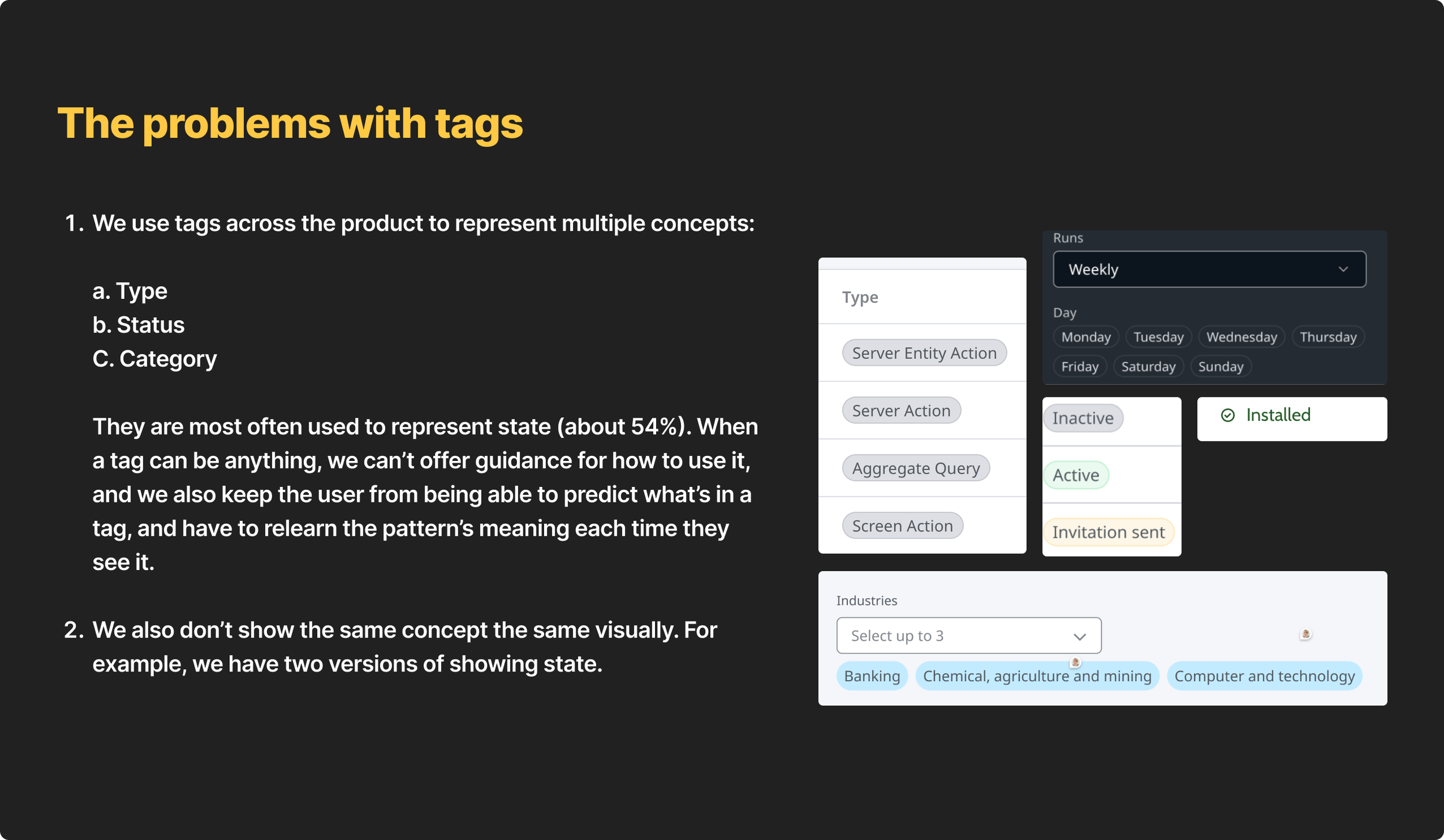
OutSystems was scaling its developer cloud platform, ODC, across multiple product teams. The design system existed, but had no content layer. Designers and engineers made language decisions in isolation. The same concept had three different names depending on which team built it. Date formats were up to the designer or engineer’s preference. Nobody agreed on whether something was a "configuration" or a "setting."
I remember a design review where a PM stopped the session to ask which word was correct. Three designers gave three different answers. Nobody was wrong, they were each following their team's convention. That moment captured the problem better than any audit could.
My job was to build the missing layer.
Four years later, 90% of the design org was using it daily.
My role | Four years, one owner, me
For four years, I owned the content layer of Fusion, OutSystem’s design system, end-to-end, not as a content strategist handing documents to designers, but as the designer building the layer myself.
In practice, that meant running terminology research, building frameworks, writing guidelines, facilitating cross-team definition sessions, speccing components directly in Figma, and building the governance processes that kept everything consistent after I shipped it. I also mentored junior content designers, acting as an informal practice lead, coaching on process, reviewing work, and helping define what “good” looked like for the discipline.
The process | Starting where every language problem starts…definitions
Working with other designers, I triaged the most commonly inconsistent concepts and met with stakeholders to create an agreed-upon word list. For stickier terms, I ran testing and included that data in the list. Many definitions went through research before they were finalized.
An example is "configuration" vs "setting." We used them interchangeably and, because of how tied they are to the UI, were consistently inconsistent in our product. To get to an agreed solution, I scraped our user community forums, analyzed the data with AI, ran cross-team definition sessions, and synthesized everything into one definition:
A configuration is global in scope and often requires additional user action. A setting is scoped to a single object or user preference and typically requires only toggling.
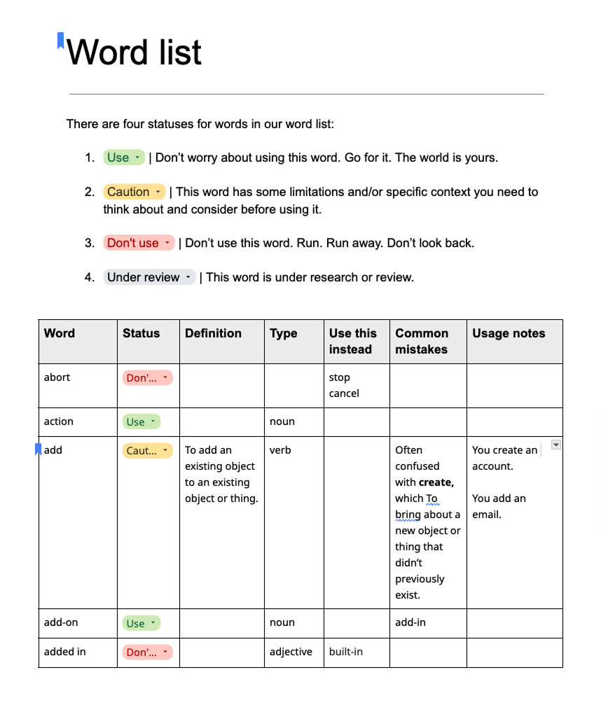
That definition went through three versions.
Early attempts tried to separate "global" and "system-level" as distinct categories, but two rounds of stakeholder testing showed those terms created more confusion than they resolved. Once the trickiest words were wrapped up, I moved onto guidelines.
I used existing user research, competitor benchmarking, SME knowledge, and testing data to write tone, voice, and syntax-specific guidelines: date formats, relative time formats, file extensions, and more. Then I dug into our Figma library analytics to figure out our most used components, then audited how those components in our product and defined guidance for them.
The guidelines and frameworks I built gave designers and engineers a way to make content decisions without asking me every time.
Some examples:
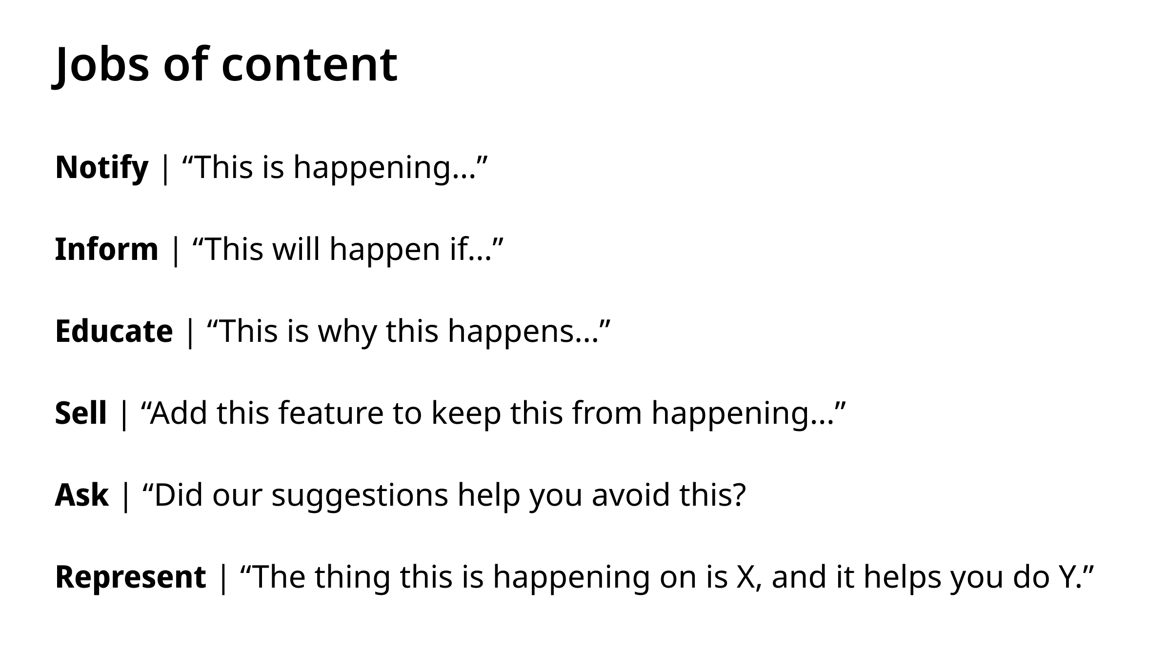
Jobs of content: Six things content can do: Notify, Inform, Educate, Sell, Ask, Represent. This became the lens for every alert, tooltip, and empty state and for component decisions. A table's main job is to represent data. Not sell. Not educate. That distinction alone resolved dozens of recurring debates.
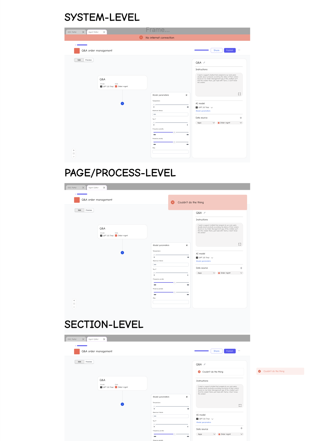
Content component hierarchy: A six-level framework (System, Page, Section, Group, Component, Element) defining how each level of the UI communicates to users.
Exit CTA decision tree: A flowchart that answered "Cancel, Close, or Done?" once and for all.
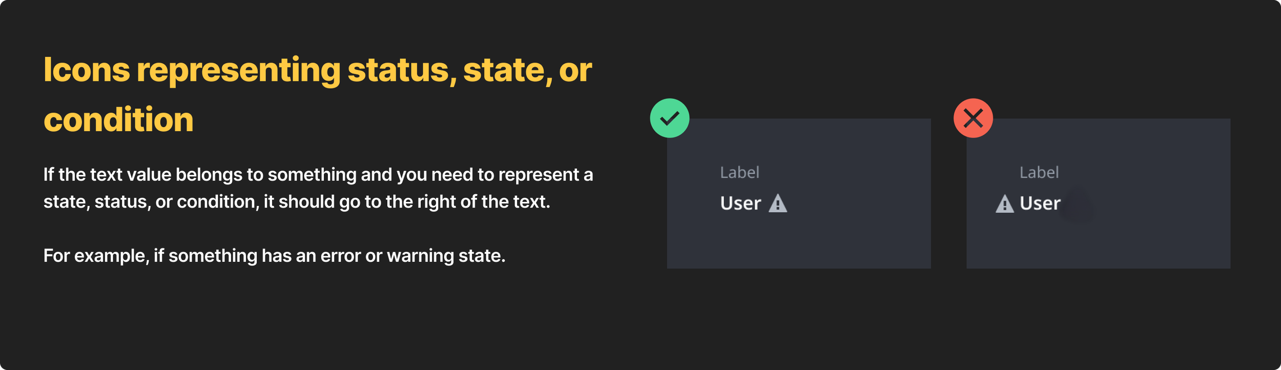
Icon placement guidelines: Left for type, right for state or status.
Link behavior audit and guidelines: Four distinct behavior patterns, each with clear rules.
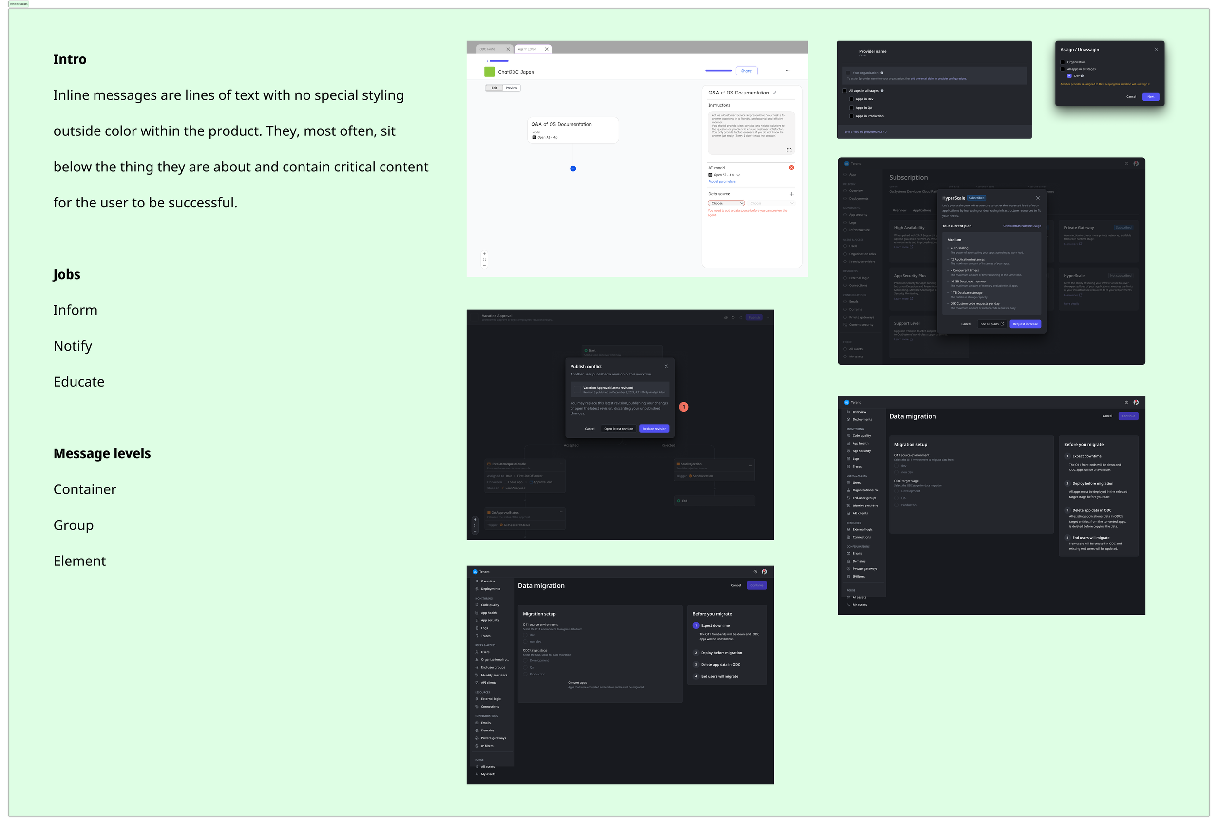
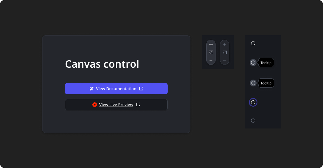
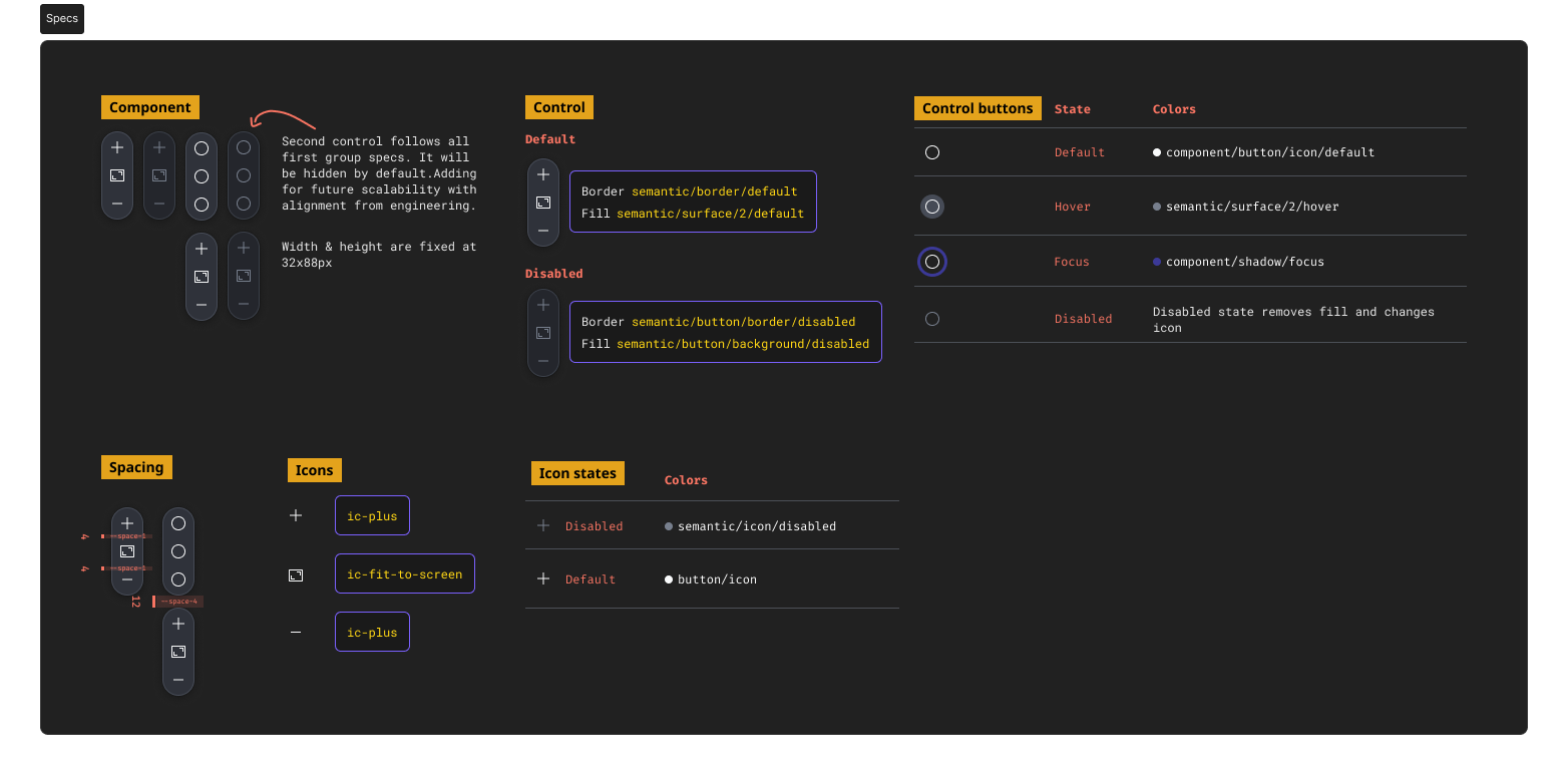
I didn't just flag component issues, I designed the fixes. Working with our engineering lead, I prioritized which changes had the highest consistency impact and sequenced them into sprints alongside feature work. I specced min/max widths, design tokens, states, and breakpoints, and designed net-new components including the Canvas Control, Inline Message, and Context Footer from the ground up.
To make the frameworks stick, I built governance processes like a content review process embedded in design reviews, a shared word list with a defined approval process, and regular syncs with product teams to catch decisions before they became inconsistencies. Without the governance, the frameworks would have stayed documents nobody used.
At the end of my time at OutSystems I was working with an engineer to design and build an AI-driven tool trained on our design system docs, making guidance conversational and acting as an automated design review that linted Figma flows against token values, behavior, content, and motion guidelines. This project was in early stages, but it’s one that’d I’d pick up in any role.
Impact | What four years of building produced
400% increase in usage over four years turning content guidance from a resource teams hadn't heard of to one many considered essential to daily design decisions.
~$712k estimated annual savings in designer time based on survey data across 19 designers at $75k average Portugal salary. Approaches $1M at $100k average salary.
~68 of 75 designers (90%) used the content layer at peak adoption. An additional 10-25 engineers, PMs, and technical writers used it as a secondary reference.
40+ components documented with content guidelines.
Reduced terminology friction across 6 teams. Alignment meetings became Slack messages like "I checked the word list and wanted to confirm this was the right word."
Shipped 3 net-new components, 8+ additional component variants, and countless bug fixes and updates in Figma component library.
Established shared language. The Configuration vs. Settings definition impacted how we redesigned navigation, reducing conflicts in wireframes and how the product was organized.
External validation. Jobs of Content published as a blog post at external request.
Adopted as AI infrastructure. Multiple teams included the guidelines in their AI prototyping rules as source-of-truth input.
Mentored junior content designers and acted as informal practice lead across the discipline.
Taught externally. Systems Thinking for Content Designers workshop delivered to 175+ designers at companies like Canva, Atlassian, Google, Uber, and Lowe's
What I'd do differently | build with friends, not for them
The hardest part wasn’t building the frameworks, it was driving adoption, which I started calling “building in public.”
I learned that introducing new design resources in a large organization is a change management problem, not a quality problem. You can build the best framework in the world, but it will sit in a Confluence doc nobody reads unless you build the organizational infrastructure around it. That’s the lesson I carry into every system I build now.
From the start, I'd co-create frameworks with engineering and product leads earlier rather than presenting finished work for buy-in.